
Portfolio
Outside-In Design

Conversion
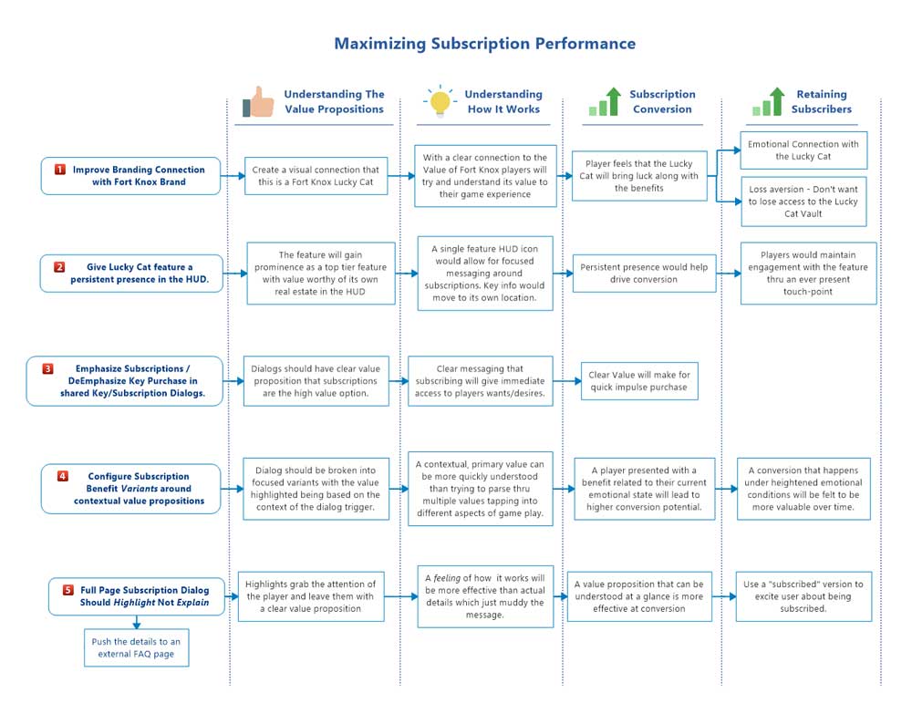
Improving Subscription Conversion
Objective:
After launching the Fort Knox app it quickly became apparent that users were confused about how subscriptions work. We were getting more CS contacts about subscriptions than anticipated so we began to analyse the in app presentation of the feature in hope creating more clarity about the feature and thus better user experience. In evaluating the current experience we also saw several opportunities to improve understanding of the value proposition of the feature which would likely drive up conversion of non-payers into subscribers.
Original Dialog

The Subscription Dialog was initially designed to to push both Key purchased and Subscription purchases.
Keys purchases were primarily designed to drive subscription purchases since the comparative value of unlocking a single piece of content vs unlocking all content with a subscription would be clear.
Usability Study:
Before we launched we did a qualitative usability study. The focus was on the full experience for a new user so “Subscriptions and Keys” dialog were only one element of the study.
Focus of Study:
- Discovery – Can players find key features
- Functional Understanding – Are features understood and usable
- Desirability – Would the play use the app once it was available
Findings:

Subscription and Key Dialog: Most users felt the key dialog had stronger, simpler messaging than the subscription portion of the dialog box. Most found subscriptions too difficult to understand and wouldn’t buy it based on that assessment. One user felt that subscription was so off brand it didn’t’ seem like part of the company or part of Fort Knox.
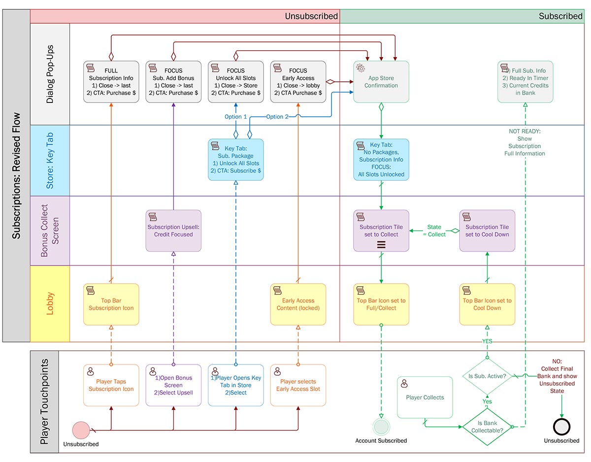
Revised Flow Diagrams:
New Key Flow

Revised Subscription Flow
Prototype:
Typically with an app that is already live and where we will be using a fair amount of existing UI elements, I will create high fidelity interactive prototypes to get a better feel for how the new or redesigned feature integrates with the live app.
LINK: Subscription Revision Prototype
As with most of my prototypes I try to build any optional variations into the prototype so they can be easily compared. I use the landing page to launch the prototype variants with the proper global variables set to give the experience specific to that set of options.
