Portfolio
Outside-In Design

Mobile Usability
Mike Wallis – Sr. Director of Product and executive Stakeholder for this work.
“(Peter’s) UX insights are spot on and align with industry best practices–he always has the end customer’s best interests in mind”
Objective:
Reverse Multi-Year Retention Trends
The Casual Casino game space had become much more crowded and competitive. As one of the first big apps in the genera, we had a strong loyalty base, but DAU and MAU numbers were flat and retention meta-game features had become more sophisticated at affecting player behavior patterns.
The process included analyzing the mobile experience of DoubleDown Casino to look for usability issues that could be contributing to the trend of flat revenue growth and declining user retention.
The goal was to propose a strategy for reversing the revenue and retention trends with a combination of UX improvements and UI feature enhancements.
The Player Story:
I am a casual gamer who likes games based on chance. I experience the urge to play from a broad range of triggers and in many different situations. I want to be able to jump into the DoubleDown game app and quickly choose a favorite game. There is a large catalog of games in the app and choosing deciding to play an old favorite or try a new one can be highly emotional. I want to be able to find favorites quickly but I also want to discover new content that fits the way I like to play.
Outcome:
- 15% increase in Revenue over previous 3 years
- Time in app increase.
- Retention metrics up; DAU, MAU
Case Study Details
Discovery:
Meet With Stakeholders
- Meet with Customer Service to discuss patterns in customer contact issues.
- Review recent User Studies and Focus group findings
- Evaluate Data
- DAU trends by game type
- Revenue & Wager activity by title
- Meet with the Product Manager and Design Team to go over current experience.
Identified Areas of Focus:

Purchase Funnel
- Access point enhancements
- High Engagement Features for Payers
Retention
- Timed bonuses (Trigger>Action>Reward)
- Progression features (Action>Reward>Investment)
- Content Discovery (Variable Reward>Flow)
Focused Discussion: Weekly UX Sync-Up Meeting
I schedule a cross-functional, weekly, UX Sync-Up meeting where all disciplines are to discuss UX work being done company-wide. These are a good vehicle for the occasional deep-dive Ideation exercises since we have cross-functional representation.
- What is creating friction in the current interaction flow?
- Are Desktop and Mobile experiences aligned? Should they be?
- How are current players navigating, choosing and playing content?
- What are the opportunities available for improving the UX?
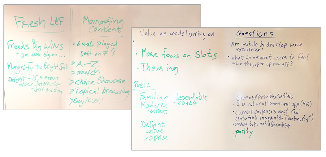
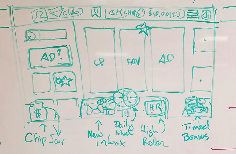
Write Up: Mapping of Brainstorming Results to Current UI
- I Converted the notes and artifacts from the cross-functional UX Meeting into areas to target with design explorations.
- The next step was to deconstruct the current app and map the key ideation takeaways to the features that would need to be redesigned.
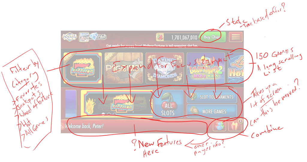
Redline of Current Home Page
Ideation:

Cross-Functional Design Thinking:
It was time to take the findings from the initial analysis and pull the Stakeholders back into the Design Thinking process.
Meet With Stakeholders
- Take notes and redlines and discuss options for new design solutions.
- Whiteboard options
- Discuss technical opportunities and limitations.
Meeting Organizer: UX Design (myself)
Attendance:
- Product Manager
- Art Lead
- Engineering Lead
Outcome
After multiple variations on how to address the issues that I had identified prior to the meeting, the team settled on a revised information architecture and a new visual hierarchy that addressed the key areas that we determined needed to be redesigned.
- Increased the footprint of the game content browsing area.
- Add meaningful high-level content filters including a new “Favorite” tagging functionality.
- Replace the underutilized footer bar with a persistent meta-game menu that would support new retention features that the Product Managers had identified as having high ROI value.
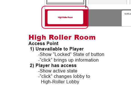
- High-Roller user-selectable interface swapping. This would support paid features and dynamic high-roller content.
Wireframe:
Design and Present
- Taking the meeting notes and loose sketches I create refined wireframes for the revised layout of the interface.
- To present the new layout to the Stakeholders I created a feature-by-feature presentation to support an upcoming Green-Light meeting where the new design would get approved or sent back for revisions.
- The presentation materials would focus on how these changes impact both the user and business goals.
New Wireframes
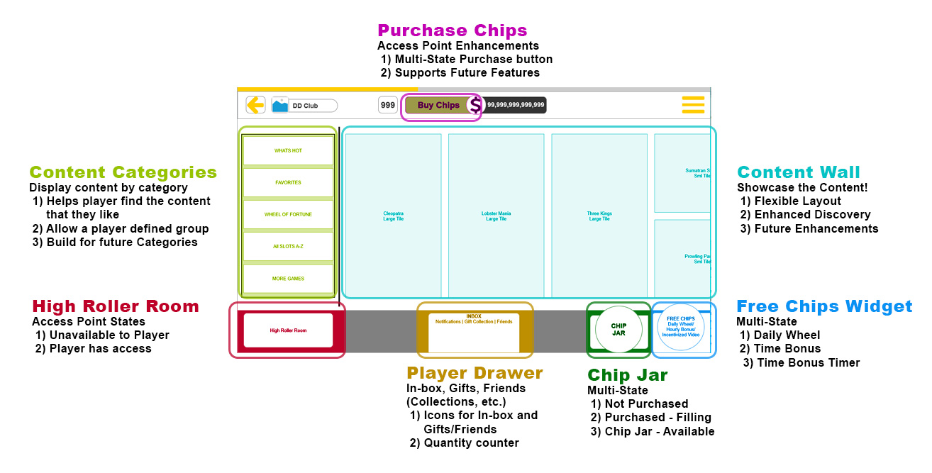
Feature: Enhanced Focus On Content

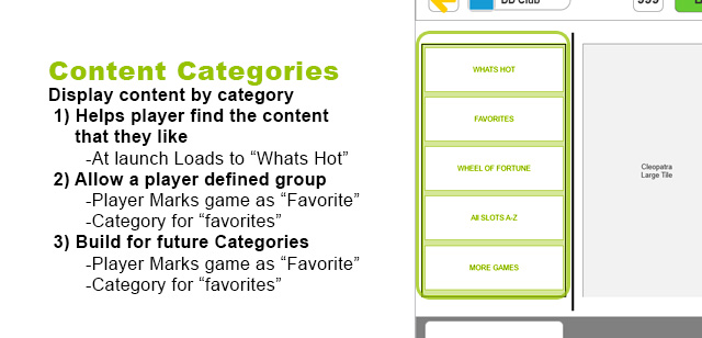
Feature: Categories for Better Discoverability
Feature: High-Roller Room for the Engaged Gamer
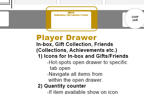
Feature: Unified Player Progress and Retention Features
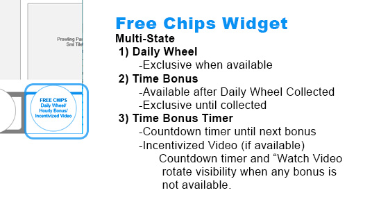
Feature: Return Player Incentives & Session Length Drivers
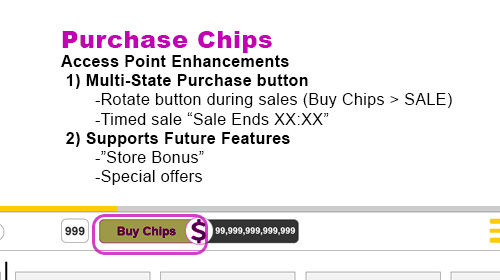
Feature: Revenue Drivers and Purchase Incentives
Purchase – Store Access Point
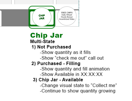
Feature: Player Loyalty “Piggy Bank” Feature
Prototype:
The final step in aligning Stakeholders around the enhancements and new features we would run by our executive, Go/No-Go gate review I built the following interactive prototype in Axure RP.
