
Portfolio
Outside-In Design

Analysis & Strategy
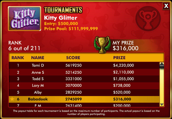
Analyzing Usability: Inconsistent Pattern Usage and Visual Noise.
Double Down Casino was the original app for Double Down Interactive. Numerous updates had been applied to the app over the years. Some of this work had been applied as a full visual update, but many of these additions to the app were applied on a feature-by-feature basis with a loose consideration for interaction patterns established in earlier iterations.
The Art Director overseeing the Double Down Casino app approached me to analyze the app for usability issues that could be addressed primarily with the art resources under his management org.
The obvious starting point was to evaluate the interaction and graphic design patterns in one functional feature flow, looking for inconsistencies. The feature with the least consistency with the core game loop of playing slot machines was the Tournaments feature.
Objective
Analyze current features in the DoubleDown Casino desktop app for usability issues that can be addressed with a minimum impact on the over stressed engineering resources across the organization.
- Analyze the interface for Usability
- Identify inconsistent visual design and interaction patterns
- Propose a UX improvement strategy requiring minimal engineering resources
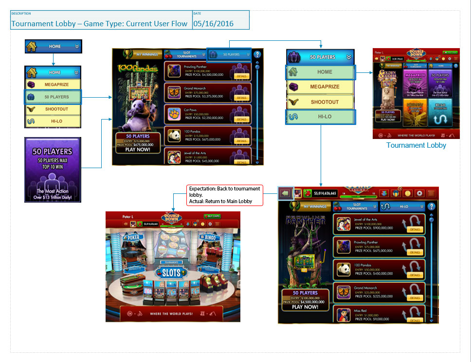
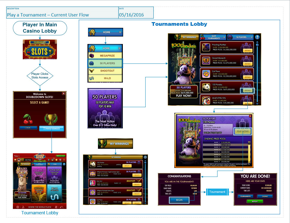
Current Interaction Flows: Tournaments
Issues Identified
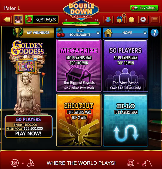
Navigation Flow:
- FLOW is stifled for players who enter DDC to play tournaments.
- No direct link from the Main Menu
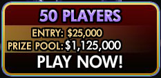
- Player must click on Slots link then make their choice from an interstitial dialog
- Once in the Tournaments Menu the player needs to navigate into individual Tournament types before they can see what titles are available.
- This creates an interaction pattern requiring drilling in and backing out through each tournament type
- The pattern prevents the player from easily choosing a tournament based on a preference for a specific title.
- No direct link from the Main Menu
Inconsistent Navigation Patterns:

- Navigating to a Tournament Style with two very different navigation models
- Drop Down Menu (Somewhat hidden)
- Once in a list for a specific tournament type, this is the only way back to the “Home” page or a different type of tournament.
- If you use option 2 (below) this is hidden functionality.
- The “Back” button would be more intuitive but leaves the feature lobby entirely.
- Once in a list for a specific tournament type, this is the only way back to the “Home” page or a different type of tournament.
- Large graphical buttons (First choice because of the velocity provided)
- Once at a list you would need to use the other navigation model, the drop-down to get back to the “Home” menu.
- Problem: Player needs to jump to a different interaction model to return.
- Once at a list you would need to use the other navigation model, the drop-down to get back to the “Home” menu.
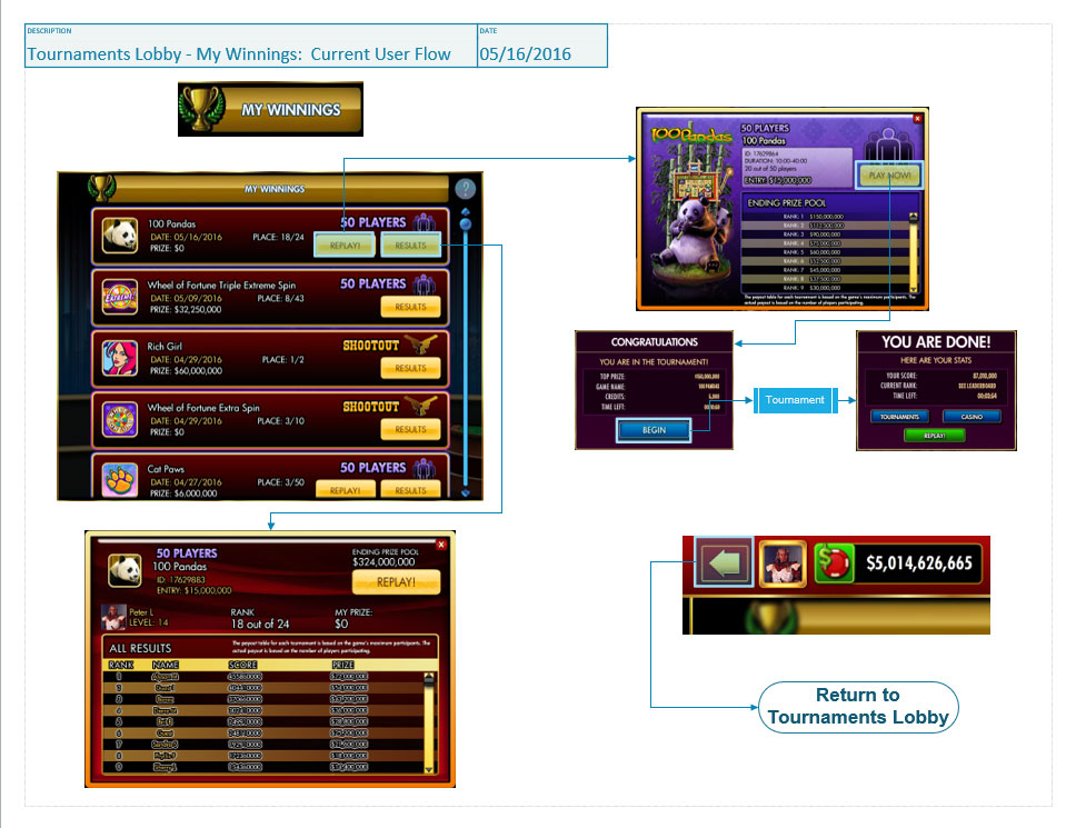
- “My Winnings” dialog requires the BACK button to return to the Tournaments Lobby. This interaction pattern is inconsistent with the other sub-lobbies within this feature.
- Drop Down Menu (Somewhat hidden)
UI Visual Design
Distracting Menu Backgrounds
- Overly detailed visual treatments distract from the important navigation options
- Too many patterns and unnecessary physical indicators like edge shines and shadows.
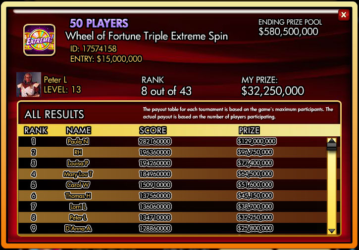
- UI/Visual Design – Text legibility
- Text is double stroked making the text throughout this feature very difficult to read.
- Inconsistent with the other feature areas.
- Double stroked text is only used in this feature area within the app.

Color Branding
Menus of available tournaments don’t carry through the strong color branding of the tournament type they are associated with.


Inconsistent Button Treatment
- Inconsistency with button styles between this feature UI and the rest of the app.
- The detailed pattern overlay of the buttons hover-state
- This visual treatment is not used in other feature areas of the app.
- The detailed pattern overlay of the buttons hover-state

Business and User Value:
- User Value: Getting the player into a tournament more quickly will get that player into the FLOW state that is a primary trigger to play.
- Business Return: More time in the Flow means longer sessions and more opportunities to get players into the purchase funnel.
- User and Business Value: Improve the professional look of the Tournaments lobby will improve the overall impression of DDC being a serious contender for their entertainment dollars.
- Research has shown that users perception of a product having and delivering value to them has a strong correlation to the players perception of the visual quality of design. Does it look professional?
- User Value: Reducing friction points and confusing UX interaction pattern..
- Reduces time till player gets into their Game Flow
- Interactive patterns that align with their previous experiences leads to a satisfying user experience.
- Unexpected pattern shifts cause high cognitive load as a user searches for why an alternate behavior seems to be indicated.
Solutions:
Multiple solutions are presented to give a range of options.
- The MVP in Solution 1 will require the least support from engineering
- This option will address some but not all of the value propositions outlined above.
- The other solutions will require additional levels of engineering resources.
- Solutions 2 & 3 add more potential for influencing player behavior by providing more effective nudging towards purchasing behavior.
| Option | Description | Scope |
| Solution 1 | Clean Up the Visual Design | Small |
| Solution 1E | Enhancements to Visual Clarity | Medium |
| Solution 2 | Improved UX Functionality | Medium |
| Solution 3 | Direct Access to Tournament Lobby | Medium |
Proposal 1: Cleaning Up the Visual Design
MVP
This solution will address the UX issues that are introduced in the Visual design and visual aspects of the current implementation of the Tournaments Feature.
- Removing distracting visual details to highlight the data and content that is important to the user.
- Display Data in a clear, easy to read text style and text friendly backgrounds.
- Standardize common elements within the casino.
- Dialog buttons (example the “Close” button)
- Dialog borders – treatments where applicable
Assumptions
This solution will not address some of the interaction inconsistencies that are introducing negative patterns into the User Experience.
Resource Requirements
Art: Visual Design; Asset preparation
Marketing: Prepare a plan for surfacing changes to lapsed users.
Engineering: Integrate new art; Rebuild CSS Text treatments and font attributes where required.
Mock Ups
The following mock ups were created by Visual UX Designer, Elizabeth Mitchel, in collaboration with my analysis and proposals.
Proposal 1 (Extended): Enhancing the Visual Clarity
MVP+
This stretch goal solution will add more visual clarity to the current improvements by adding unique skinned graphics to the elements that currently use generic graphic elements. This will add color ques to those elements making it easier to quickly parse the elements into Tournament types where those types are mixed together as well as making pages with a single type look more clearly grouped by that type.
- Extend color coding of tournament types to generic elements.
- Rework generic UI elements to support the 4 color codes designating a tournament type.
Assumptions
This solution will EXTEND solution 1 and requires that both Solution 1 and 1E be part of the work. Solution 1(E), however, is not required to be included in the feature enhancements outlined in solution 1.
This work was broken out into a separate part because it requires additional engineering support to implement the enhanced features.
Resource Requirement
Art: Visual Design; Asset preparation
Engineering: Integrate new art; Apply CSS text treatments and font attributes where required.
Proposal 2: Improved UX Functionality
MVP
In addition to all the visual changes in Solution 1 this solution will address the following UX issues that are affecting both FLOW and Negative UX Patterns.
- Option 1 (Quick Fix)
- Tournament Lobby: Hook up back button to go to “Home” in T-Lobby from any sub-lobby.
- This is the quick-fix for the confusing Drop-down navigation requirement once the player is no longer in the Tournament Home screen.
- Option 2 (Ideal Solution)
- Replace dropdown menus with a tab pattern configuration.
- This solution keeps all navigation options within the Tournament lobby visible and easily accessible with a single click
Assumptions
This solution in Option 2 requires the current navigation pattern to be partially re-worked to create a more intuitive tab pattern. This will make navigating around the Tournament lobby quicker and with less negative actions occurring. The latter benefit can be met with either option mentioned above.
Resource Requirement
Art: Option 1- No work; Option 2 – Design Tabs/Icons for navigation
Marketing: No Requirements
Engineering: Partial reworking of navigation
Proposal 3: Direct Access to the Tournament Lobby
MVP
In addition to all the visual changes in Solution 1 this solution will address the following UX issues that are affecting both FLOW and Negative UX Patterns.
It is recommended that this solution be implemented along with the Solution 2 work but it is not dependent of that work being implemented.
- Add a Hard Link into the Tournament lobby from the Main Menu casino lobby.
- Should Include separate Slot Tournaments and Video Poker Tournaments access points.
- Optional functional flow: One Tournaments access point. Use an interstitial to choose between Slots and Video Poker tournaments.
- Unlike the “Classic Slots” “Tournaments” interstitial this dialog gives the player an “Value Added” choice. If tournaments are your ‘thing’ then you might be interested to try out other tournament offerings.
- This also gives us a Scalable flow should we ever offer other types of tournaments such as Poker or Blackjack tournaments.
- Slot and Video Poker buttons would go directly into their respective lobbies.
Assumptions
This solution requires work outside of the Tournaments lobby and would affect the functional flow entering both Slot Tournaments, Video Poker Tournaments and solo play.
Resource Requirements
Art: Make changes to Lobby
Marketing: No requirements
Engineering: Remove interstitial; Hook up new lobby functional flow
Next Steps:
This document and the work behind it were part of a larger effort to put together a series of self-contained feature revisions to some of the areas in the app that I determined had serious enough usability issues that they warranted some resources being allocated to address them.
Since engineering resources were the hardest cross-functional group to free up I started with areas that would take a minimum of engineering effort.
Prototyping and continued Visual Design would be among the next steps if this effort earned a spot on the product road map.
